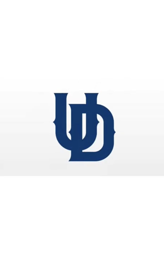
Over the summer, the University of Dallas’ Athletic Department announced a trio set of new logos representing the student-athlete community: a sharp monogram of “UD”, a Crusader logo and finally “UDallas”. Both Jared Samples, the Director of the Athletic Department, and Pauly Ulrich, Director of Sports Information, gave their insight on this rebranding and answered some clarifying questions.
For starters, the original “UofD” logo has represented the Athletic Department for over 20-30 years however, there were some difficulties with the logo in terms of identity and practicality.
The University of Dallas commonly gets confused with The University of Texas at Dallas. In order to distinguish themselves, Crusaders often refer to themselves as part of “UD” as “UDallas”. Although this was clear for the inside of the community, “UofD” wasn’t for anyone outside of the UD bubble.
“We previously used the ‘UofD’ interlocking logo for all of athletics,” Samples said. “Some people outside of UD didn’t understand the old logo and thought it was hard to decipher”.
Additionally, with the placement of the “of” in the middle of lettering, it made graphic designing flyers and announcements difficult, especially in trying to center it.
Now for the biggest question of them all, how was the athletic able to afford this rebranding for the department and for the student-athletes’ equipment and uniforms?
“The University’s Marketing Department was doing a rebrand for the entire institution, so we fell under the umbrella,” Samples commented. “It will be a slow roll out in Athletics because it would be too expensive to change everything that we have. Old uniforms and gear will be phased out and anything purchased new will use the updated logos.”
“We received an entire package of new designs in the rebrand, including a mascot, multiple wordmarks, a logotype, official fonts and a new “UD” monogram,” Ulrich said.
With that expectation in mind, the athletic department created a committee team composed of Samples, Ulrich, and Monica Heckman who serves as the Head Athletic Trainer and Assistant Athletic Director. The committee worked with Daniela Madriz, the lead designer for the rebrand, with the consideration of what UD stands for.
“We provided Daniela with lots of input and specific examples of what to emulate and what to avoid, boiling down to a main goal: bring the UD brand into the modern age, but in a timeless manner,” Ulrich commented. “We wanted some
thing that was crisp, clean, easily recognizable and readable, and something that wouldn’t look out of place in the year 2050 or 1950.”
Currently, the new logos are fully being used on practice gears, the athletic’s website, the athletic’s social media, the Presto database and game day uniforms for on-season athletes. In consideration for the fans, the updated logo will hopefully be available in the bookstore or in their respective online stores for full representation.
As the sports editor that has worked under the athletic department for the past three years as home game statistics, I fully understand and support the new logo implementation and encourage others to do the same.
“Though this stark rebrand may be jarring for the student-athletes and faculty who have been here for some time, we hope this new brand is something that they will be proud to represent and cheer for,” Ulrich said. “We believe these logos will stand the test of time and in time, become just as much a part of UD as LITRAD.”
